01 CONCEPT
Unifiying multifunctionality
Our logo concept embraces the diverse roles of Culture Cafe, combining its identity as a cafe, gallery, and co-working space. The stamp-like mark reflects the seamless integration of these functions, symbolising the adaptability and authenticity of the space. This design ensures the logo remains flexible across various contexts, embodying the dynamic spirit of a creative and collaborative environment.


The spatial layout of Culture Cafe isdesigned for functionality andadaptability across different areas:the Cafe, the Gallery and theWorkspace.
We created a logo mark symbolising the unity of each unique purpose within the space. This brings a sense of authenticity and adaptability to the brand, visually capturing the distinct yet harmonious roles that make up Culture Cafe.
02 VISUAL IDENTITY
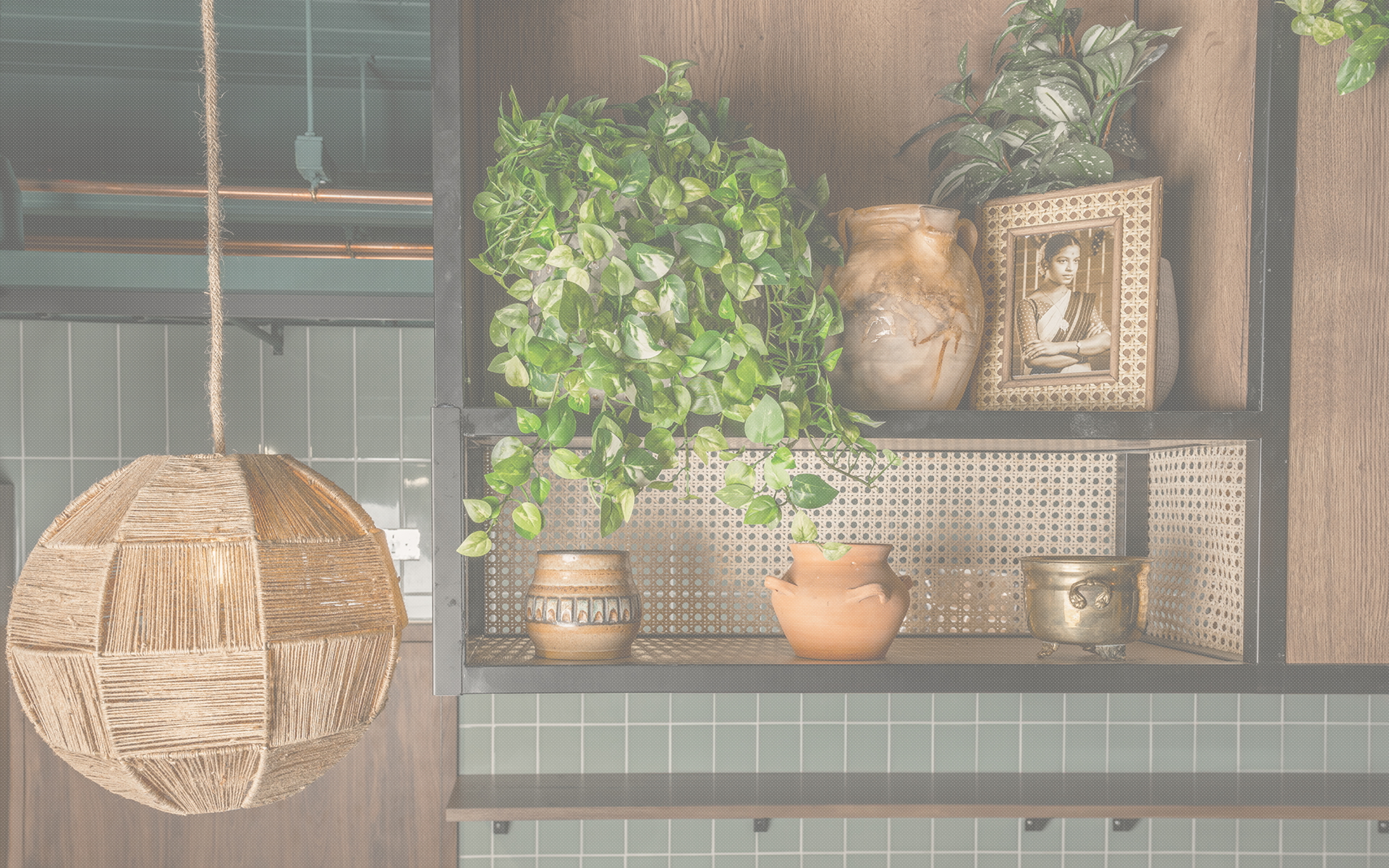
Grounded in craft and tradition
Inspired by the contemporary African aesthetic of the café’s interior, we infused the brand with the concept of ‘the imperfection of the hands,’ celebrating craftsmanship and handmade techniques. This approach emphasises the beauty of handcrafted details, bringing warmth and authenticity to Culture Cafe’s visual identity and reflecting the tactile, welcoming atmosphere of the space.

We drew inspiration from the natural tones within the space to create an earthy and warm colour palette for the brand. This palette reflects the warm, organic hues of the interior, grounding the brand in a sense of authenticity and connection to its environment.

To capture the essence of craftsmanship, we infused tactility into the logo, giving it a hand-painted quality. This tactile approach extends across digital platforms, where textured backgrounds bring a sense of materiality into the brand experience, creating a seamless connection between the digital and physical spaces.

For typography, we selected Maison Neue Mono Regular as the primary font, adding structure and a sense of physicality with its monospaced style, reminiscent of typewriter aesthetics. As a secondary font, Founders Grotesk offers a modern, versatile contrast, balancing the vintage feel with a clean and contemporary edge. This combination reflects the brand’s craftsmanship and forward-thinking, adaptable nature.

03 BRAND APPLICATIONS
Where coffee and culture meet
We developed a range of assets to ensure a consistent and engaging brand presence across all touchpoints. From coffee cups to takeaway bags and brand merchandise, each piece was thoughtfully crafted to reflect the brand’s unique identity.


social media
04 OUTDOOR SIGNAGE DESIGN
Bringing Culture Cafe to life
We designed vinyls, a wooden building sign, and graphics for the shutters to enhance visibility and attract attention. These elements work together to strengthen the brand’s presence both within the cafe and in the wider community, ensuring a consistent and memorable experience for customers.